The brand book.
Built, not memorised.
A short, opinionated reference for everyone who writes, designs, ships or speaks for FINLiT.AI. If something here fights with what looks right — argue, don't ignore.
Three rules. Everything else is a preference.
When you're stuck choosing — between a word, a colour, a layout — read these and pick the one that respects them most. They're written down so we can hold each other to them.
Show the work. Specifics over slogans, screenshots over claims, working artefacts over decks. If a fellow can't ship it, we don't market it.
We always show humans first — Cap, the mentors, the fellows. AI is the pencil in their hand. Never centre a model name; always centre the person using it.
Tone is confident, specific, numeric. Avoid hype, avoid hedging, avoid exclamation marks. If a sentence could appear on a Mastercard ad, rewrite it.
Four lockups. One personality.
The wordmark is the centre of the system — Geist 500 with a serif i and the bracketed AI chip. Everything else extends from it.
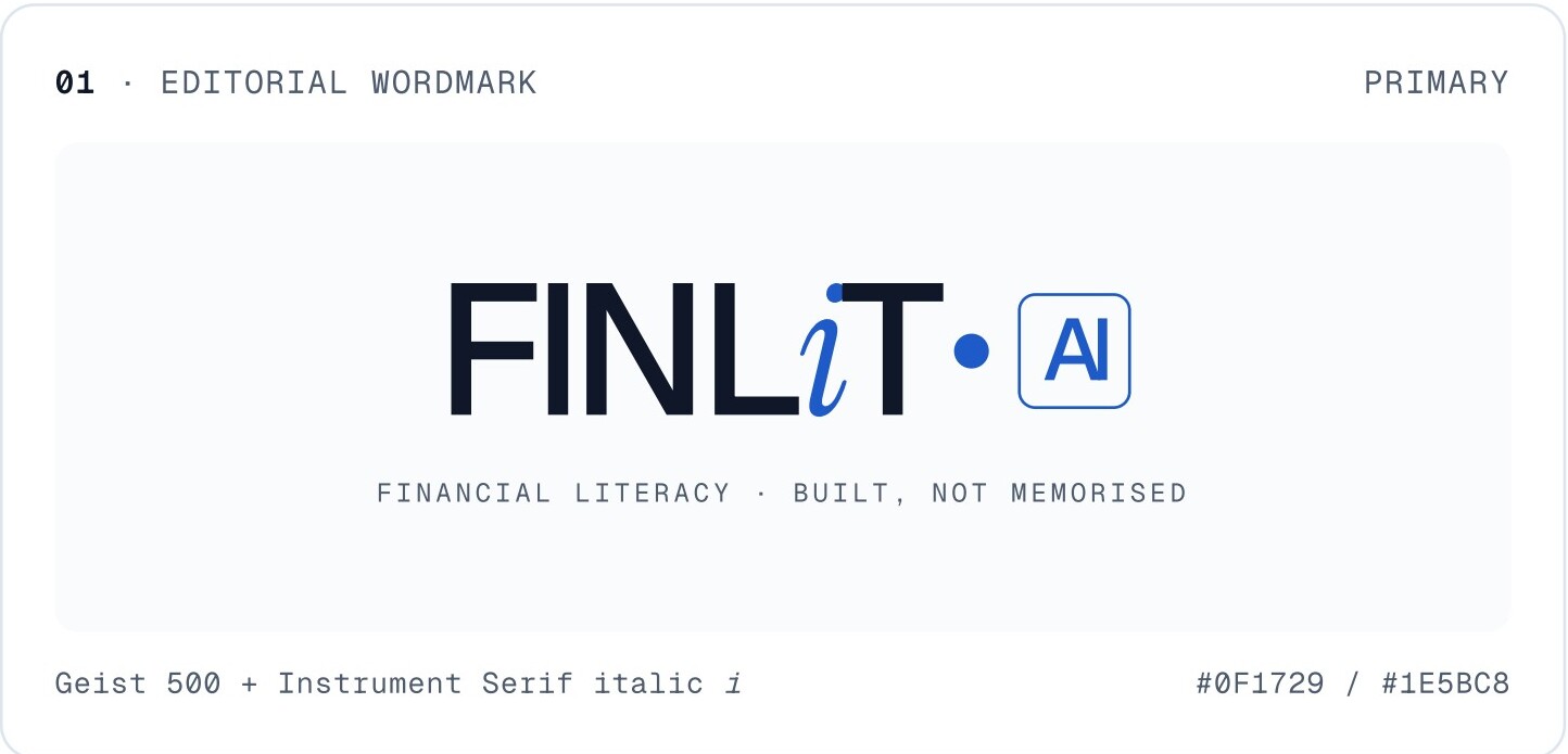
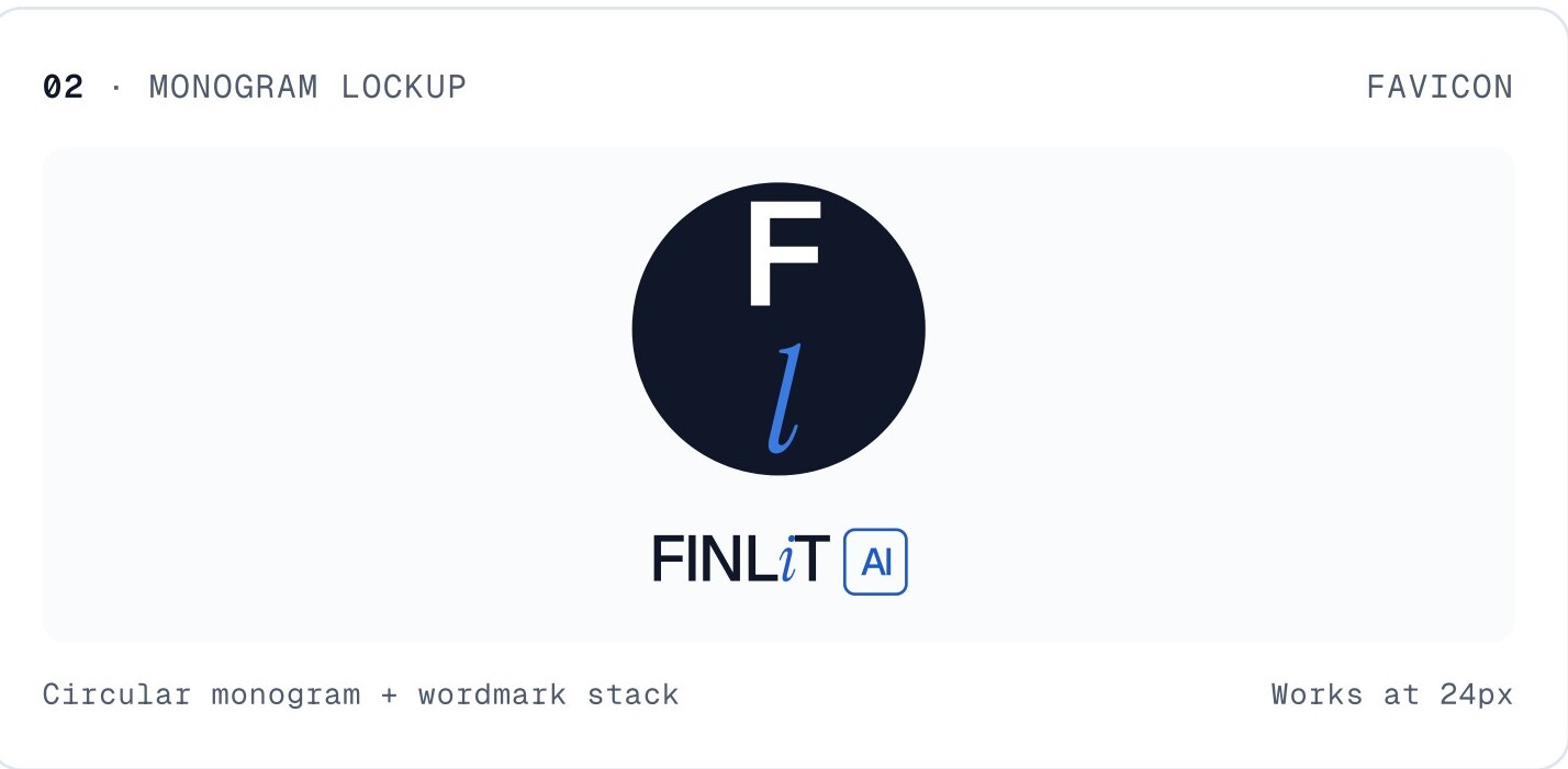
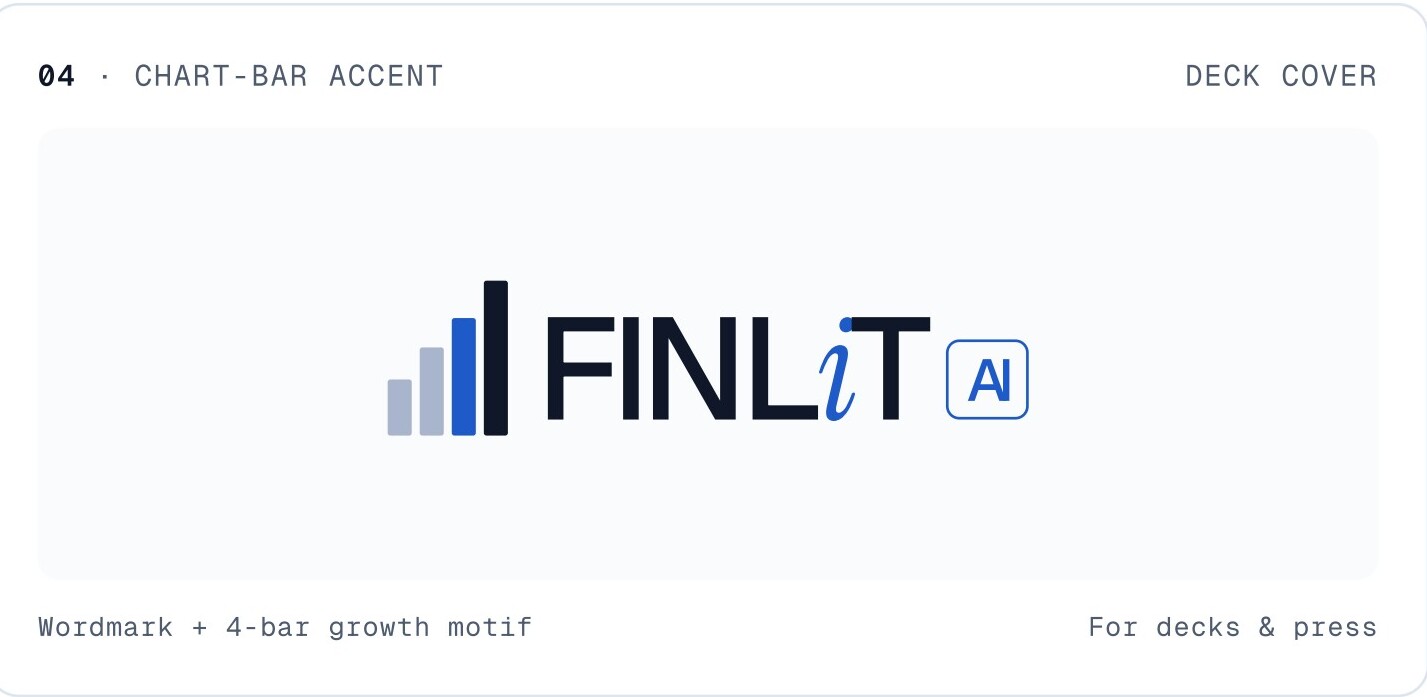
Use the wordmark as drawn — Geist 500 + Instrument Serif italic i.
Don't recolour the wordmark or the italic i.
Don't rotate, skew or set the wordmark on a curve.
Don't stretch, condense or apply outline weight.
Ink. Paper. A signal blue. A live green.
Editorial first: 80% of any surface should be ink, paper or a soft neutral. Signal blue is for the brand voice; neon green is for "live" — sparingly, never decoratively.
Three faces. No exceptions.
Geist for everything functional. Instrument Serif italic for emphasis and feeling. Geist Mono for system labels — eyebrows, dates, numbers, code. That's it.
Confident. Specific. Numeric.
We are writing for sharp 11-year-olds and their sceptical parents. Both can spot a marketing voice in three words. Don't use one.
✓ Do
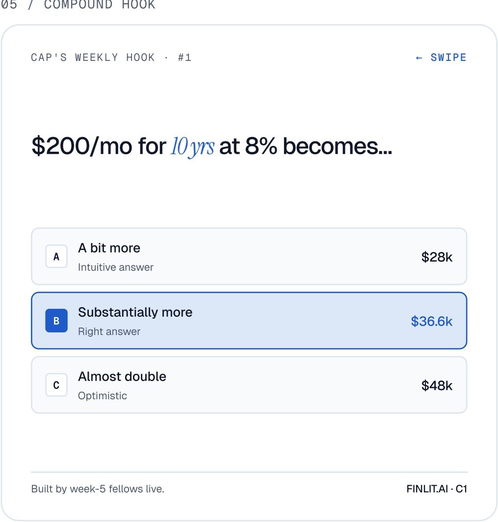
- Use specifics."$200/mo for 10 yrs at 8% becomes $36.6k" — not "the magic of compounding".
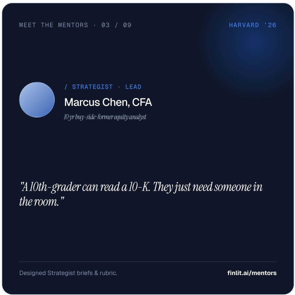
- Lead with the human."Marcus, 10yr buy-side analyst, designed the rubric." Not "AI-powered curriculum".
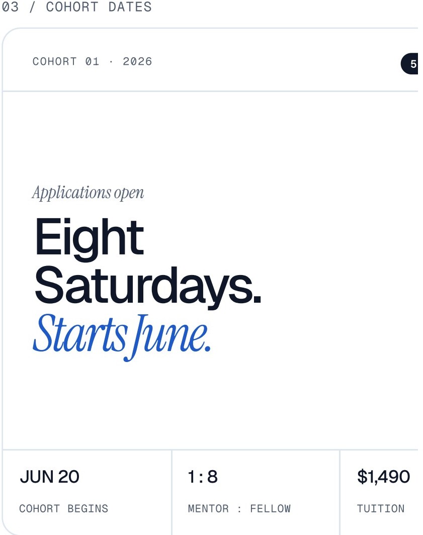
- Use lowercase + a period."applications open." reads like a fact. "Applications Open!" reads like a banner ad.
- Show the artefact.Screenshot of the budget app, not a stock photo of a laptop.
- Use the italic i as a wink.One italicised phrase per block — earned, not sprinkled.
✗ Don't
- No exclamation marks.Ever. They are a confidence leak.
- No "unlock", "empower", "journey".If you wouldn't say it across a kitchen table, don't write it on the site.
- No emoji in product copy.The exception is a single ▸ or → as a directional cue.
- Don't centre a model name.Never lead with "GPT-5" or "Gemini" — lead with what the fellow built with it.
- Don't decorate with neon.Green only signals "live". If it's not live, it's blue.
Three marks. Repeat them.
A consistent visual system is built on a few small moves used many times. These three travel everywhere: posts, decks, the site, the workbook.
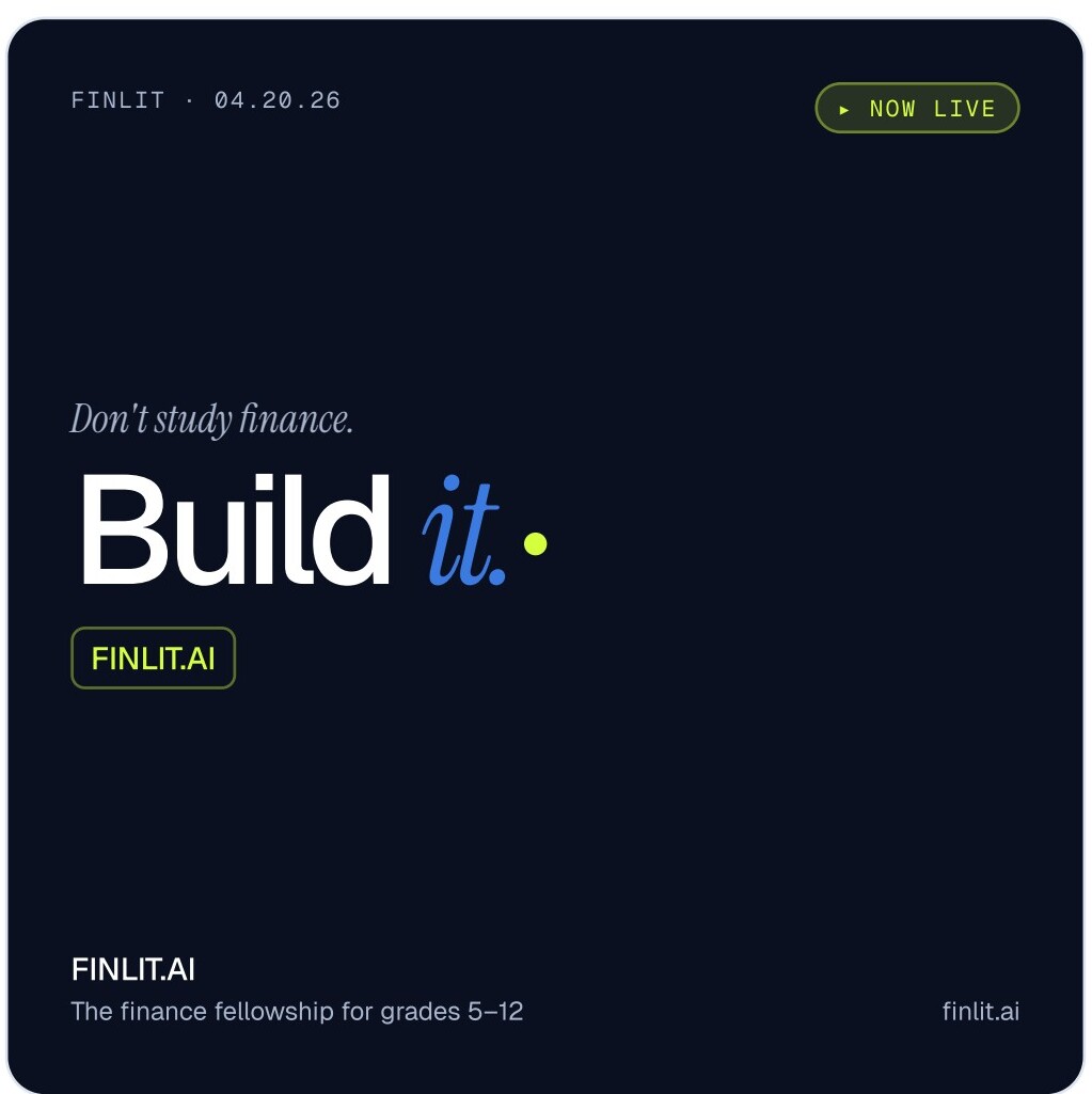
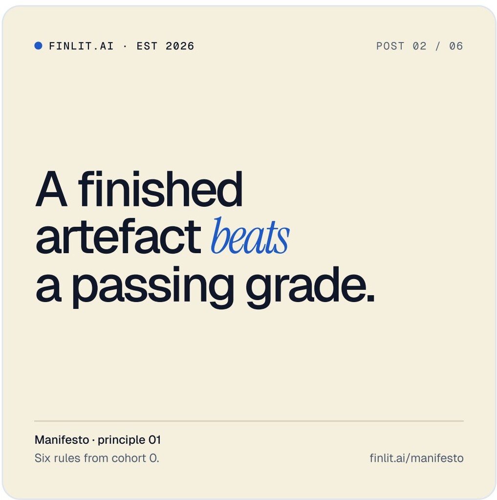
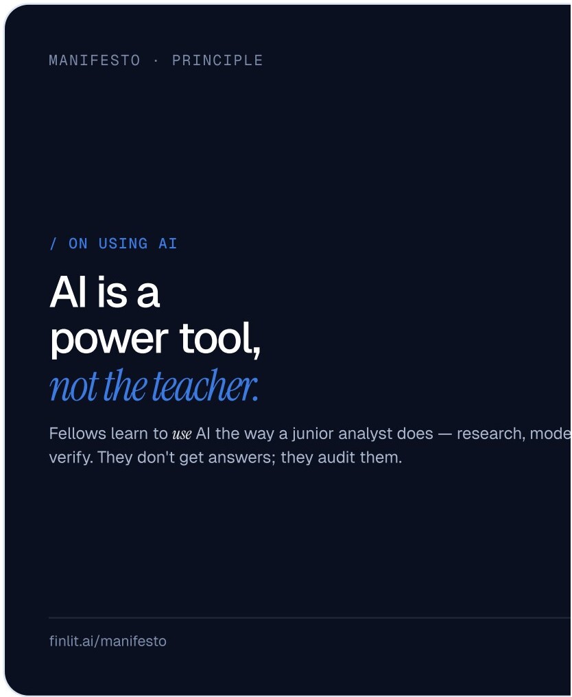
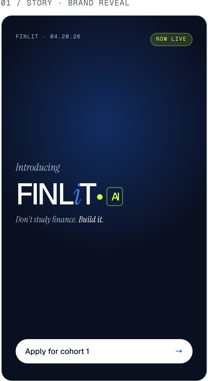
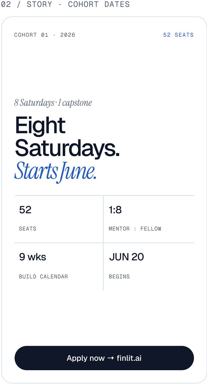
Six posts. Two stories. One launch.
Cohort 1 launch sequence. Posts run 1080×1080, stories 1080×1920. Drop into Notion or hand off to PR — they're typeset and ready.
Found a case this book doesn't cover?
Send a screenshot and a one-line proposal. We update the book monthly.
team@learnwithleaders.com